National Pediatric Cancer Foundation
NATIONAL PEDIATRIC CANCER FOUNDATION
Rise Up For A Faster Cure
The Florida-based Pediatric Cancer Foundation is a nonprofit dedicated to funding innovative research and clinical trials for gentler, more effective childhood cancer treatments, aiming to expand its life-saving mission nationally and turn the fight against pediatric cancer into a nationwide movement.
To align with their growth and enhance credibility, they sought a brand transformation, emphasizing their national presence and building confidence in the community that their donations would truly make a life changing impact in the battle against childhood cancer.
INDUSTRY
Charity
SKILLSETS
Brand Development
Messaging Strategy
Identity Design
Brand Design
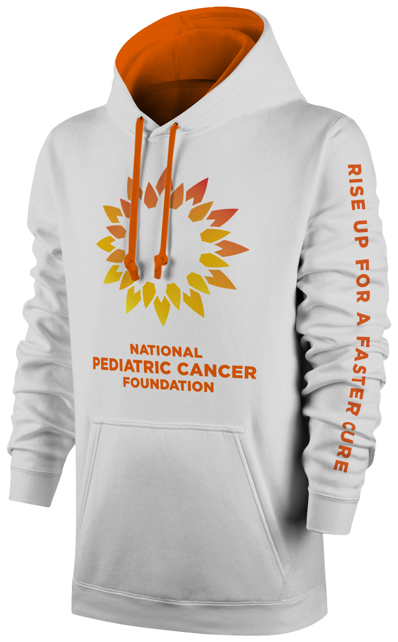
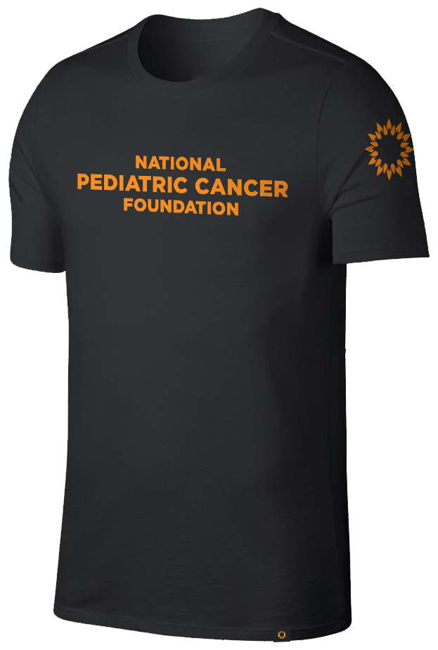
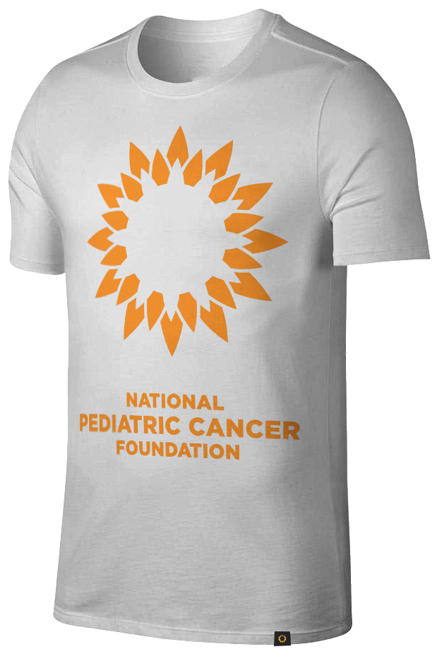
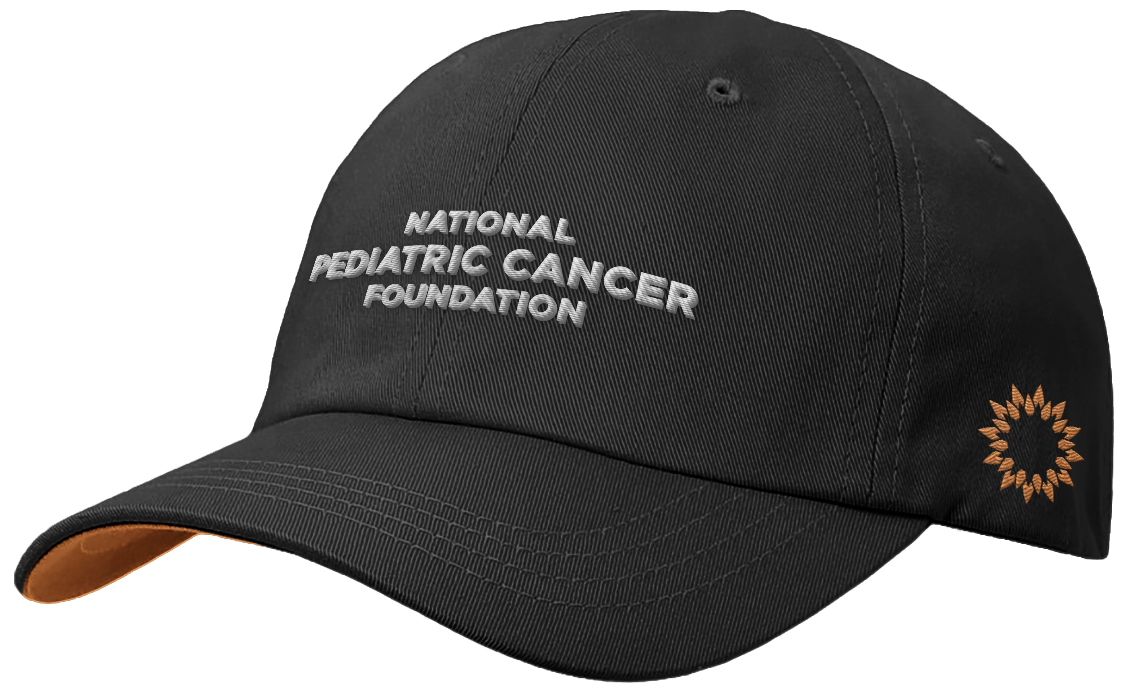
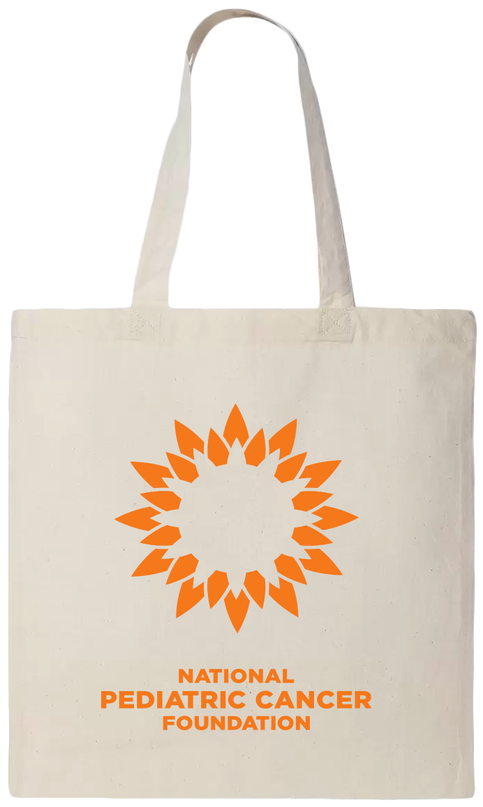
Merchandise Design
Animation
IMPACT & RESULTS
$37 Million
dedicated to pediatric cancer research.
34 Hospitals
in a coalition of participating nationwide pediatric hospitals advancing the mission.
28 Research Studies
yielding amazing results in fighting childhood cancer.
Top-Rated Foundation
that has received a perfect 4-star rating from Charity Navigator for financial health and transparency for the 11th consecutive year.
87.9 Cents
of every dollar is spent on supporting the NPCF mission.
The Mission
Transform the Pediatric Cancer Foundation brand into a recognized national cancer organization that readily invites support on a nationwide scale to fight pediatric cancer on a national level.
The Strategy Challenge
The Pediatric Cancer Foundation had a well-established brand history that we recognized as essential for its national debut. However, to gain trust and credibility on a national scale, we needed to introduce significant changes while preserving the familiarity that their existing donor base held dear to their hearts.
Equity Foundations
Sun Rise Theme - reflects a new dawn of hope for children affected by life-threatening cancer.
Sunrise Color - A key accent point with a long history of grounding the brand in a unique identifier.
The Name - “Pediatric Cancer Foundation” is a very commanding and well-known name to existing donors and is one of the core equity pieces of the brand.
KEY THEMES THAT NEED TO BE RETAINED TO PROTECT EXISTING BRAND EQUITY


Evolutionary Goals
Nationally Recognized Organization - Top priority #1 is to communicate this is a national organization that commands a larger, more impactful mission worth donating too.
A Trusted Foundation - Trust is one of the highest enablers of getting new & existing donors to give more often and at a higher amount more consistently.
Making Real Change - Tangible results are one of the most potent signs that an organization is progressing the mission in the public eye.
KEY THEMES THAT NEED TO BE COMUNICATED TO ACCOMPLISH THE MISSION
Name Strategy
OCCAM'S RAZOR APPROCH
Given the significant equity and value tied to the current Pediatric Cancer Foundation brand, it was prudent not to overly complicate the objective, focusing primarily on the essential qualifier: "National." This approach allows us to preserve the existing brand's equity and build upon it in a recognizable manner. The inclusion of "National" not only conveys a clear message of being a national organization but also lends an air of professionalism associated with government organizations and other nationally esteemed institutions.
National Pediatric Cancer Foundation
Slogan Strategy
We understood that one of the brand's objectives was to draw more donations. While the previous slogan conveyed the purpose of the organization, it lacked the urgency of a call to action. With the new organization name, "National Pediatric Cancer Foundation," already instilling trust and validation, it was clear that the new slogan should serve as an immediate call to arms, propelling the organizational mission of "beating pediatric cancer faster" into action.
OLD SLOGAN
Funding Research. And Hope.
NEW SLOGAN
Rise Up For A Faster Cure
Identity System Development
VALUE ELEMENTS:

SUNRISE


PROGRESS BEING MADE


ENABLING CHILDREN TO GROW


PROFESSIONAL “TRUST WORTHY” AESTHETIC

FINAL MARK:

ICON:
WORDMARK:

Typography


Color Palette
The NPCF brand's color palette draws inspiration from its brand narrative and core values. As an organization, NPCF has ascended, reaching new heights and achieving a new level of aspiration. Their collective research kindles hope as brilliant as the fully risen sun. This illuminating spirit radiates through our research and defines the NPCF mission.


Brand Guideline Book
Collateral Package

Brand Video
Tri Fold Brochure


Event Infastructure

Website

Doner Merch